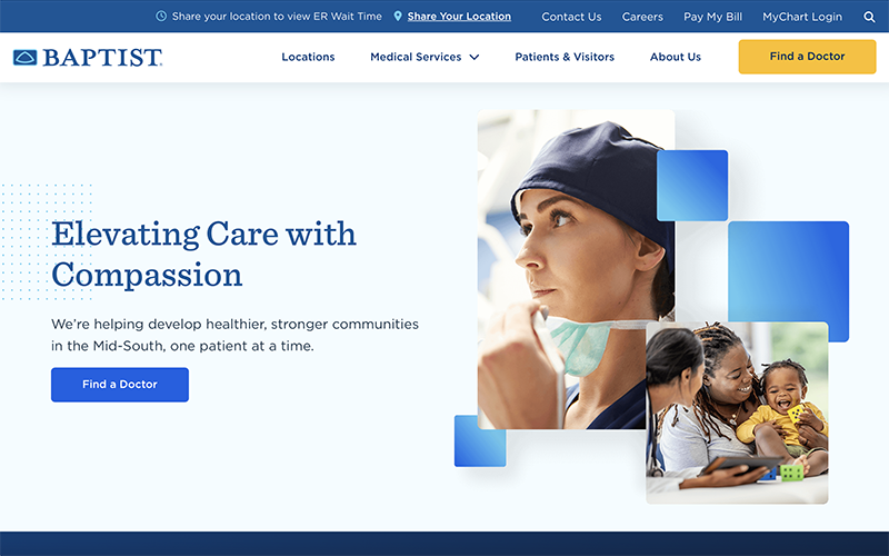
Baptist recently implemented a new homepage for BaptistOnline.org. The refresh makes the homepage more search-engine friendly and better accommodates the expectations of users. The improved navigation also allows visitors to have a more dynamic experience.
“We have completely retooled the main navigation to be more modern and interactive. For example, clicking on ‘Medical Services’ brings out a flyout menu with multiple options to allow the user to quickly find a needed service,” said Eder Causor, digital strategy director for Baptist. “It has never been easier to find information, and I’m so happy with the work done by the Digital Marketing team.”
The homepage features:
- Quick Access – Links to our most popular pages
- Explore Our Signature Services – Easy access to view all services
- Sections – Information on Baptist, our charitable foundations and patient stories
Visitors to the homepage may also quickly find a doctor, get information about visiting hours or parking, send an electronic card to a patient, nominate a nurse for a DAISY Award or donate. The ER wait time widget is now more efficient and accurate with faster load times, and the user is no longer required to share their location to use the tool.


